Project Overview
client
Telespor AS, a Norwegian company specializing in cutting-edge electronic livestock tracking solutions.
The Problem
Telespor came to me for a visual refresh. But after talking with their customer support team, I found a deeper issue: users couldn't find basic information on the site — so they called instead. During peak season, the support team was overwhelmed with questions that a better website could have prevented.
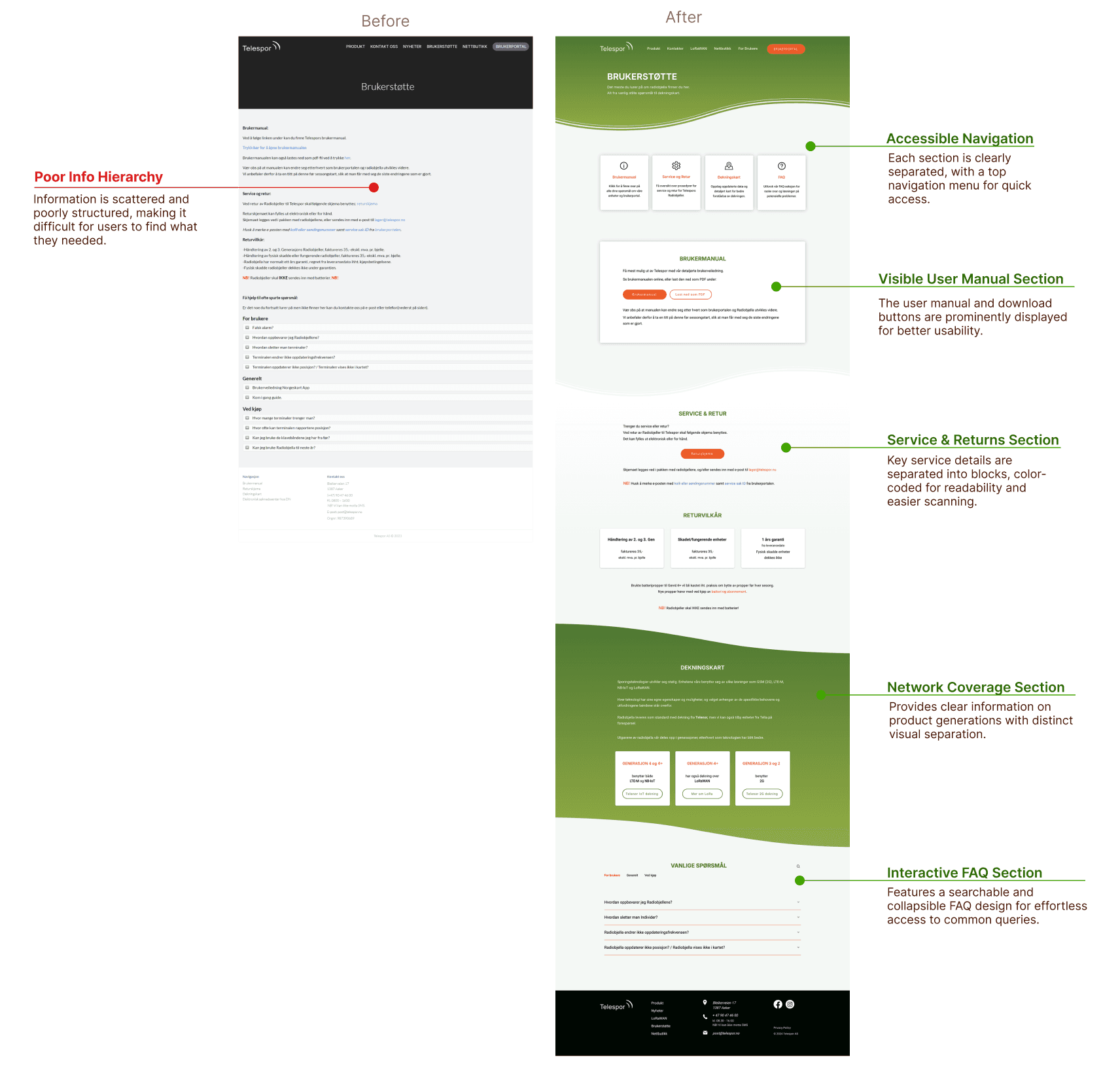
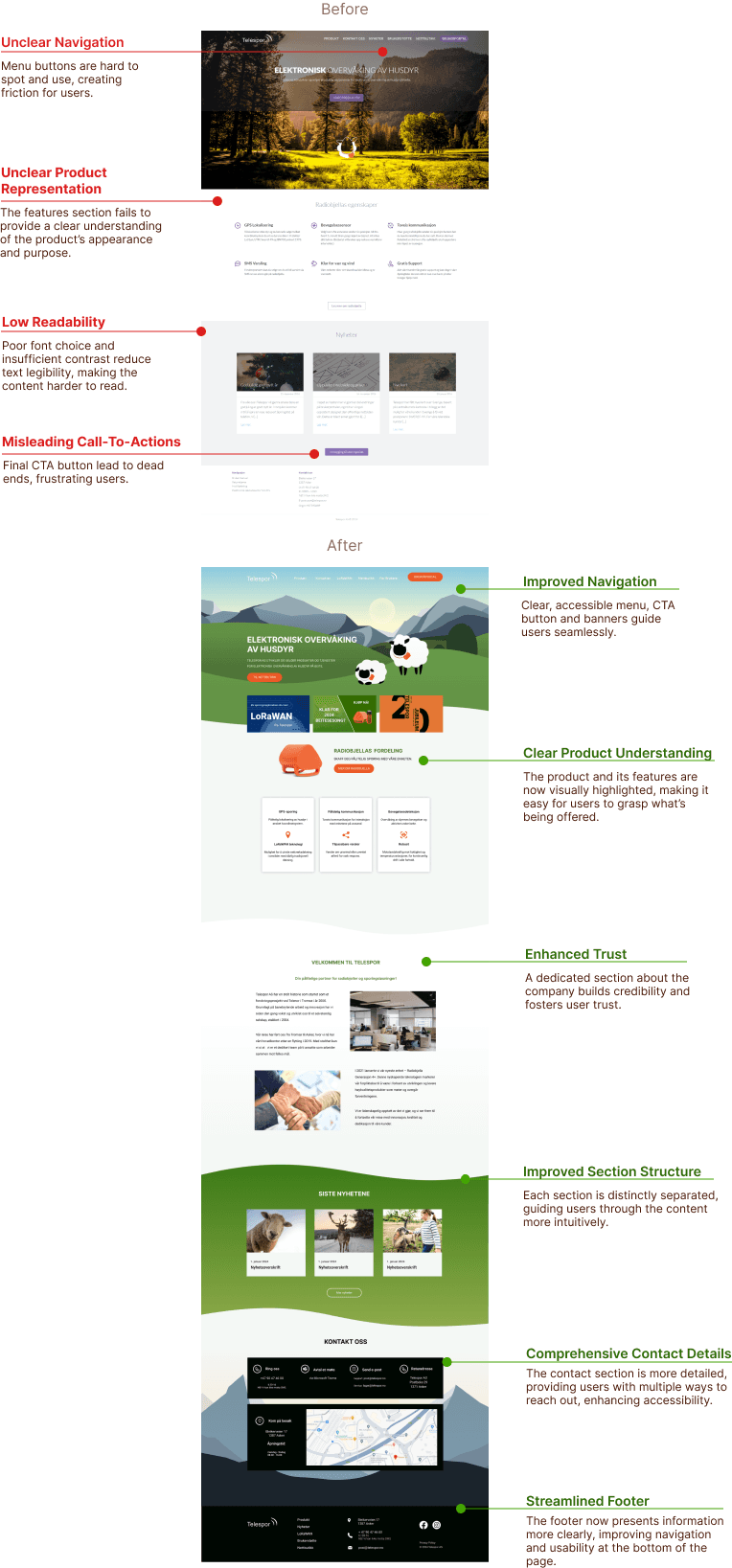
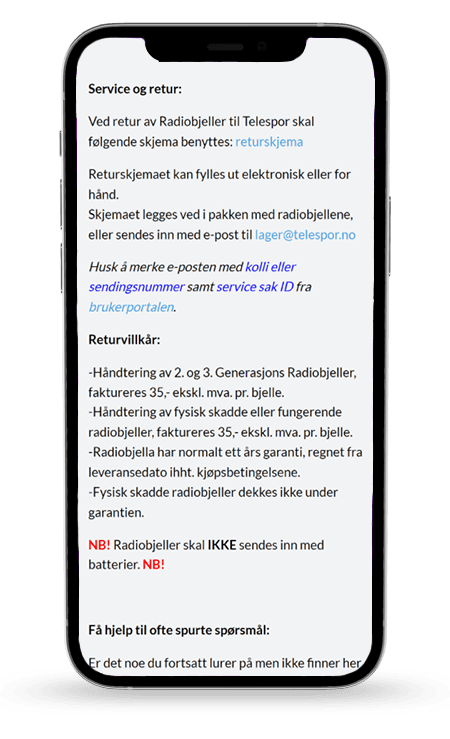
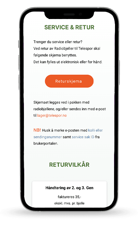
The homepage didn't communicate what the product was. The support page was a wall of unstructured text. Users gave up reading and picked up the phone.
My role
UX/UI Designer and Frontend Developer
my work
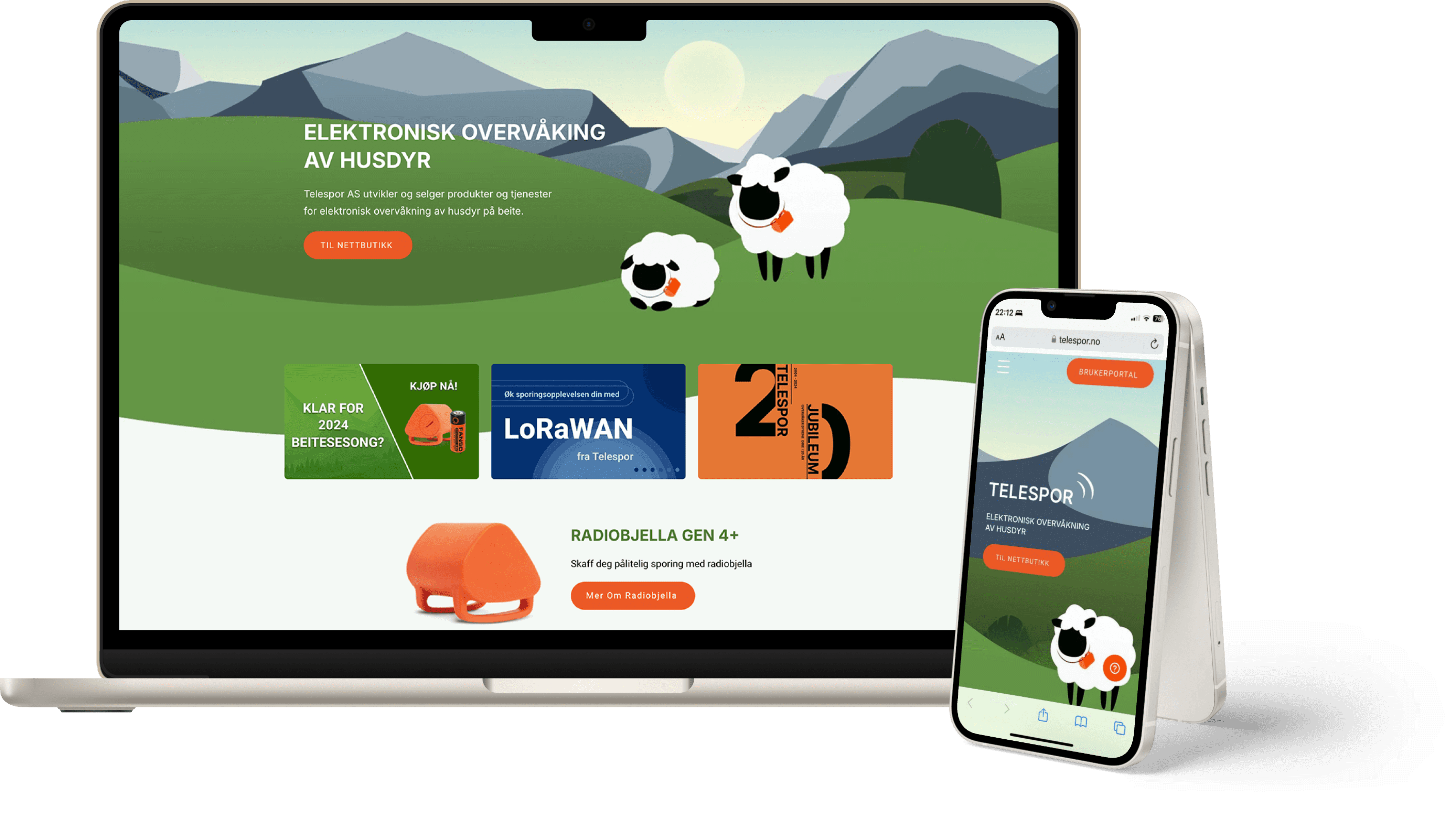
I led a full-cycle redesign for Telespor’s website, focusing on usability, product visibility, and user engagement, from planning to launch on the Wix platform.
Who I Was Designing For
Insights collected from the Customer Support team identified key user pain points.
Older, Tech-Limited Farmers
Needed more intuitive layouts and clear step-by-step guides
Newer, Tech-Savvy Users
Expected concise, visually driven information
First-Time Visitors
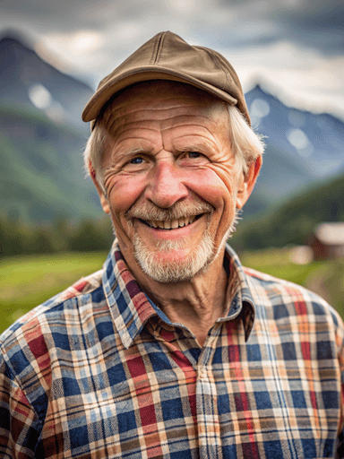
Olav Andersen, 70
Norwegian farmer
UX: 10 years
Tech: Limited
Bio
Olav, an experienced farmer, has used Telespor equipment for a decade. Despite limited tech skills, he values reliable tools and often needs assistance with digital platforms.
Goals
• Effortlessly manage and monitor livestock.
• Receive prompt and dependable support.
• Navigate a simple, intuitive website.
Frustrations
• Confusing navigation on complex interfaces.
• Overly complicated designs.
• Difficulty finding clear instructions and accessible help.
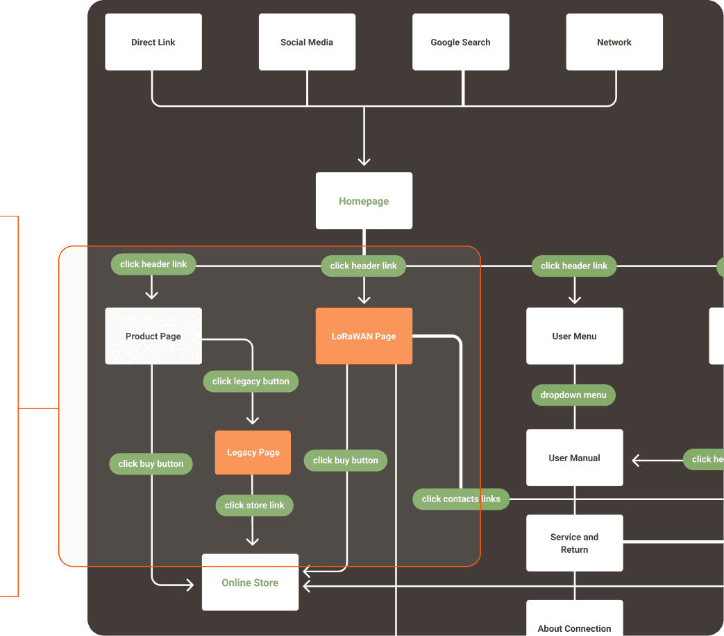
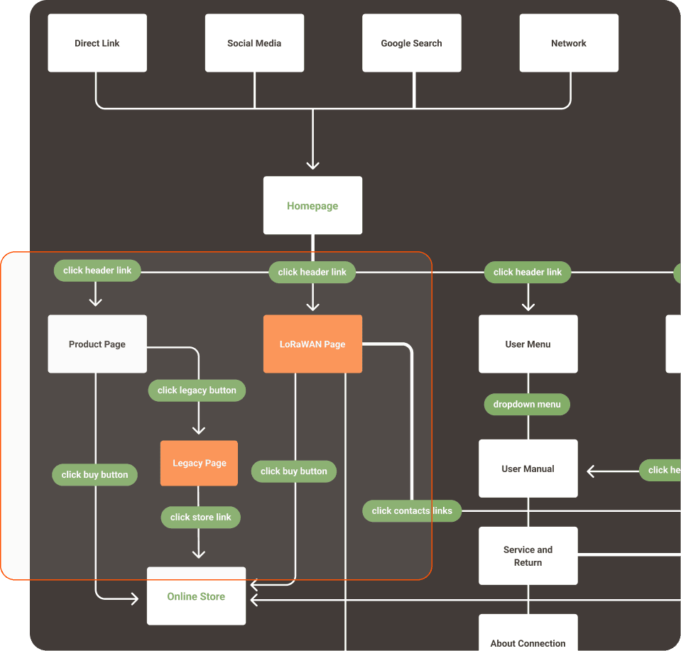
Optimized User Flow for Seamless Navigation
Most users were returning clients who already knew the product — they just needed to find information faster. So I kept the core flow familiar but restructured it around three main tasks: finding the product, booking a consultation, and accessing support.
Centralized Navigation
Focused on core actions – browsing products, booking, and accessing portals.
Streamlined Transitions
Linear user flow designed to guide users smoothly from entry to task completion.
Cohesive Page Integration
Unified new pages (LoRaWan, Booking, Legacy) with a consistent design.
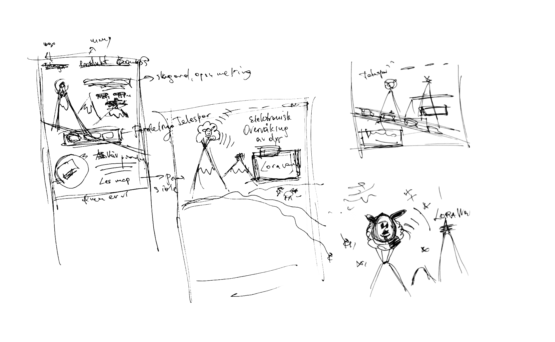
Structured Path to Product-Focused Design
I explored layout options to prioritize product visibility, enhance navigation, and guide users seamlessly to key actions.
Streamlining Workload with a Custom Booking
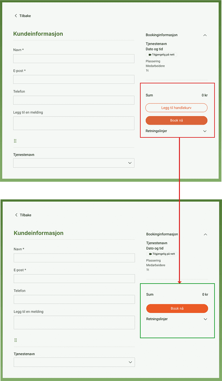
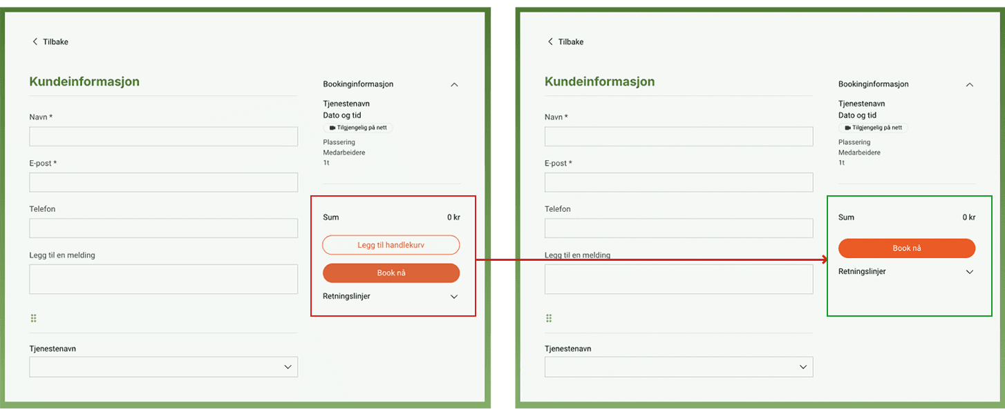
Telespor's consultation process had no structure — seasonal spikes overwhelmed the team and users didn't know what to expect.
I built a custom booking flow with calendar sync between Wix and Outlook, and a staff rotation schedule to distribute load evenly.
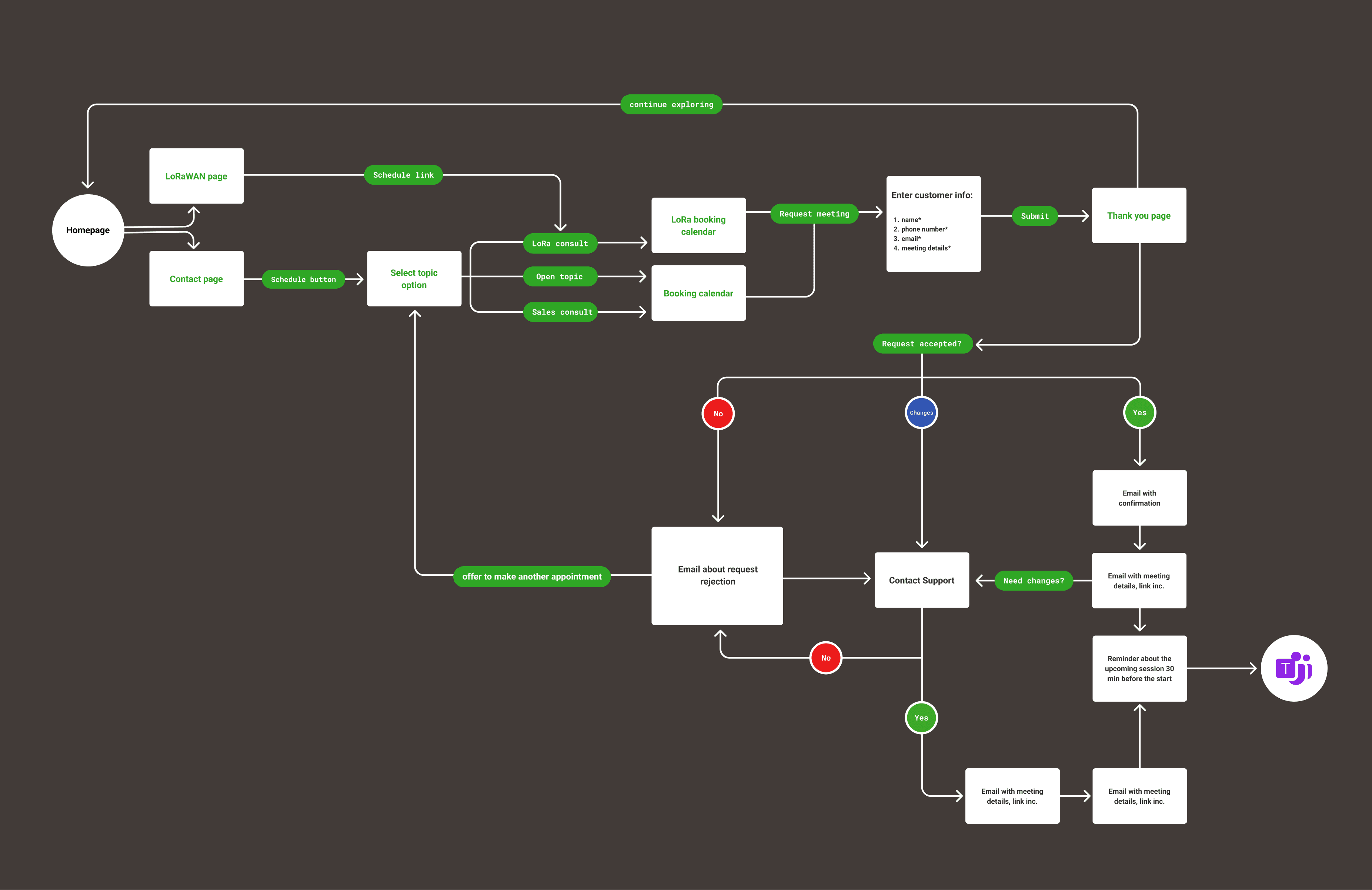
Custom-built booking flow showcasing an intuitive booking process.
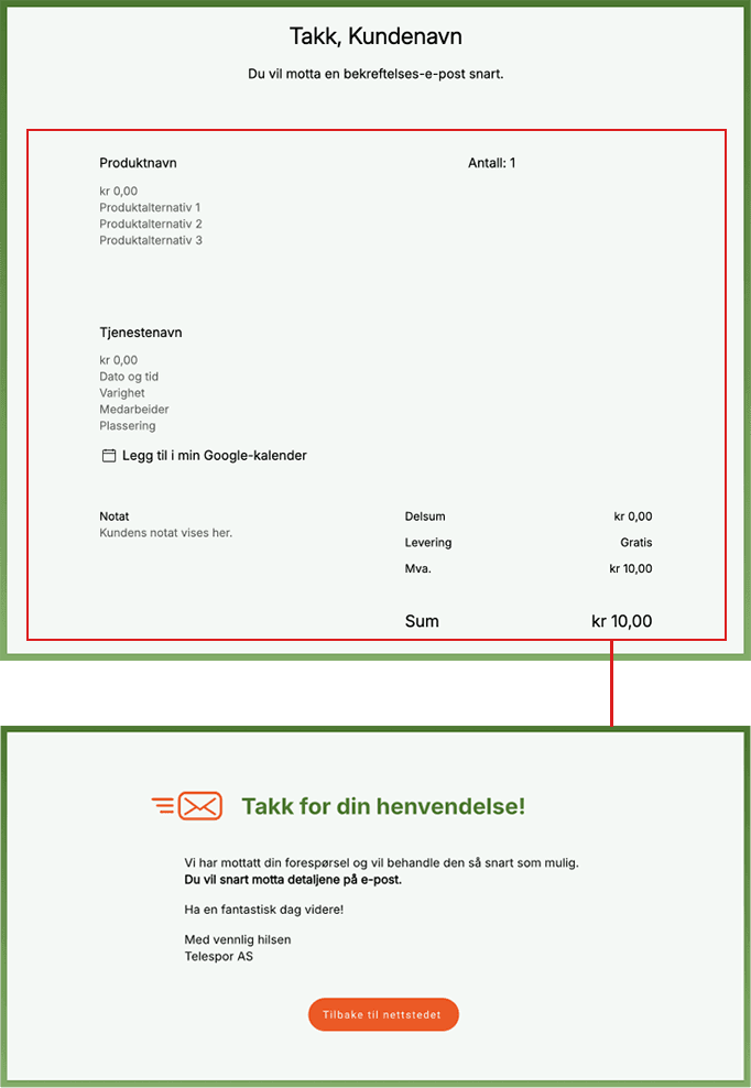
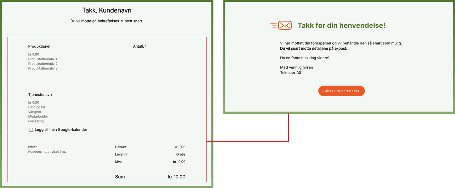
Simplifying Process to Reduce User Confusion
Before
• Shopping cart added unnecessary steps.
• Complex Thank-You page causing confusion.
After
• Removed the cart to simplify user flow.
• Simplified the Thank-You page for faster task completion.
Optimizing Mobile Access for User Needs
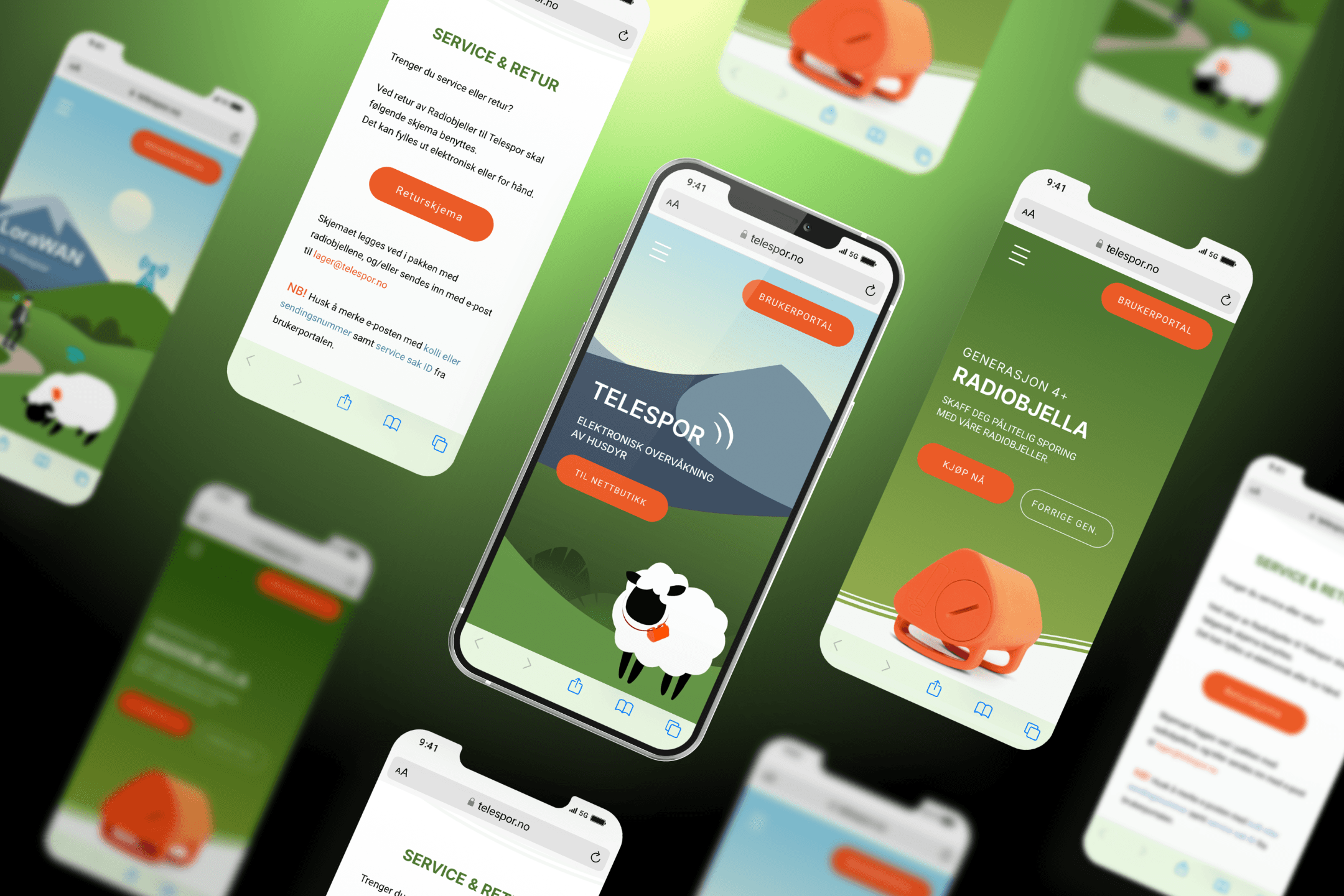
Faster and Simpler Mobile Navigation
Results
Key achievements of the Telespor redesign
Before and After
The support page was the core of the problem — and the most transformed.