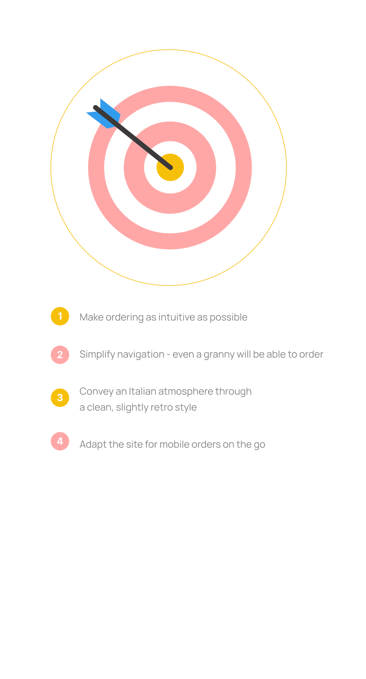
Neo Pizza came to me with a logo, a concept, and a tight budget. My job was to make sure that when someone in Asker searched for pizza on their phone, they found Neo Pizza — and ordering felt effortless.
Project Objectives
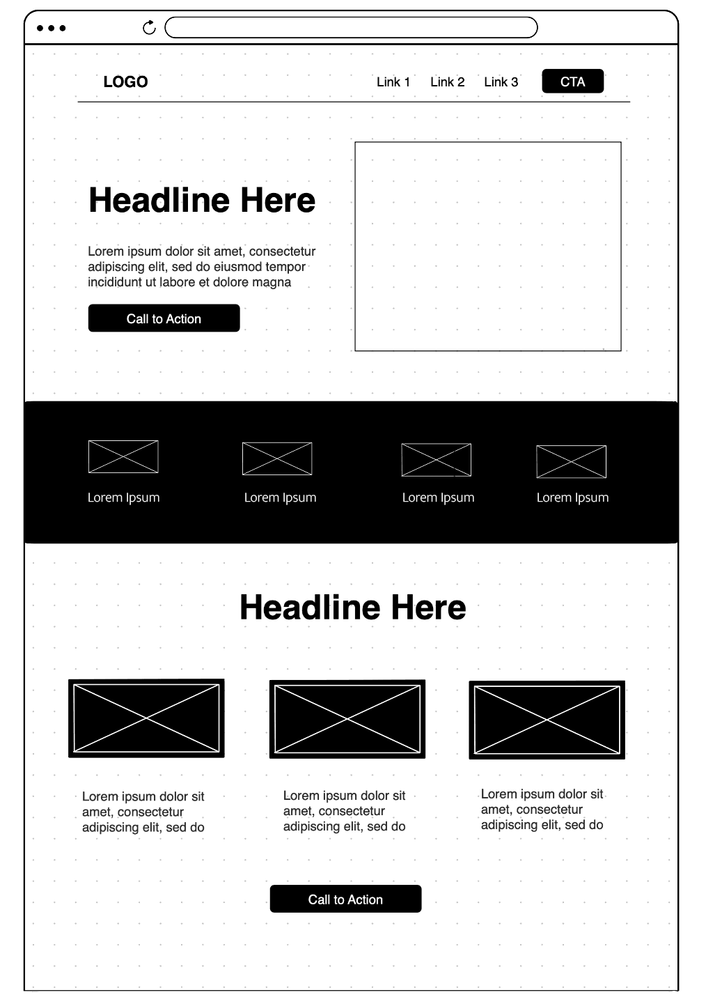
Full creative freedom, minimal budget. I proposed everything — structure, SEO, content, sticky mobile navigation, and print materials.
My Role
Tools
Duration
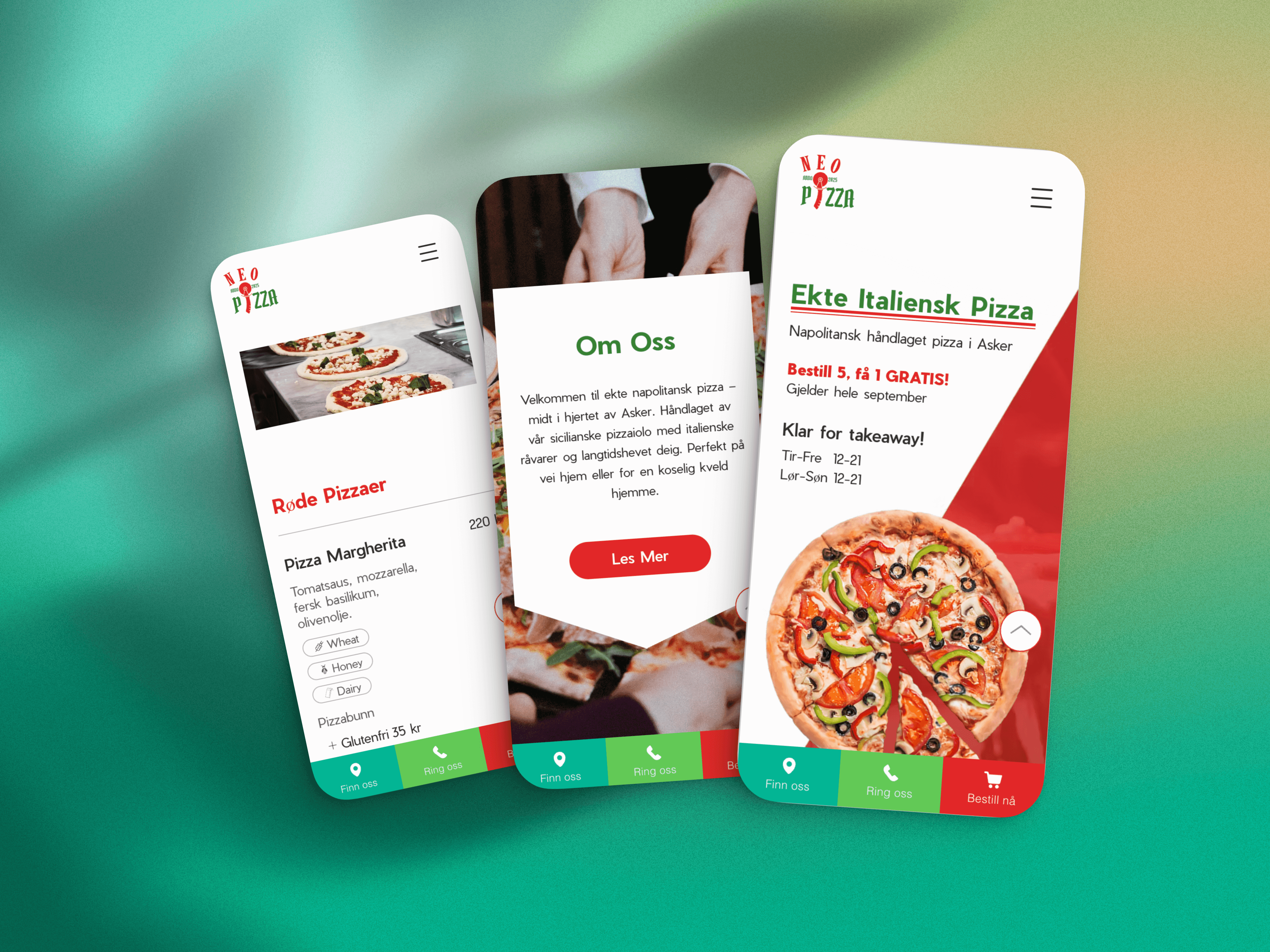
Make it feel easy, look Italian, and work perfectly on mobile

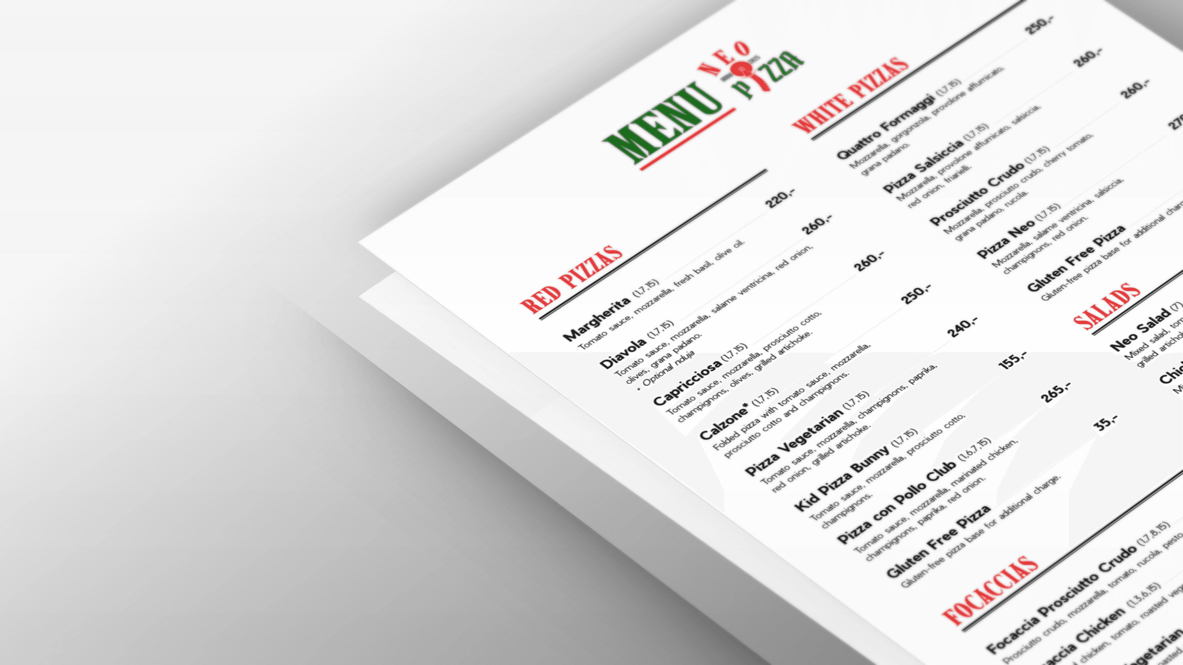
for printed menu highlights and underlines
for website headings and highlights
for contrast and readability
attention-grabbing CTA
Typography
Latin Compressed for the menu headers — evokes vintage pizza branding
Pier Sans for the website — clean, friendly, mobile-ready

This was my idea — the client didn't ask for it.
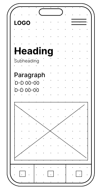
To minimize friction on small screens, I introduced a sticky bottom menu with three primary action buttons: address, phone call, and online order. These reflect the main user intents — calling to order, ordering online, or picking up pizza in person — and ensure they’re always accessible without extra scrolling.
Key metrics confirm that the initial UX and branding goals were on point
42 clicks to contact in 30 days
Sticky bottom menu ensured frictionless access to calls and directions.
435 customer orders in 2 months
Smooth ordering flow supported conversions.
74% of all traffic came from mobile
Most users accessed the site on mobile, validating the mobile-first approach.
700+ search impressions in 30 days
SEO setup led to strong visibility on local searches within 2 months.
Low bounce, steady engagement
Users stayed on site and interacted with key actions like contact and menu.
Zero marketing budget
435 orders and 700+ search impressions achieved with no paid advertising — organic SEO and word of mouth only.
Key Takeaways
Designing for real people means prioritizing clarity, speed, and flexibility
Mobile-first is critical
Key actions like ordering and viewing the menu must stay easy to access.
Essential info should be instant
Opening hours, location, and the order button need to be right at the top.
The fewer the frictions, the better
A clean layout, minimal copy, and direct flow help guide users smoothly from curiosity to conversion.
Small business = adaptability
A simple, editable site allows for real-time improvements as feedback comes in.