A local favorite with over 20 years of history, Baracoa Café transitioned from a snack bar to a modern restaurant and venue. This redesign reflects its evolved identity.
Project Overview
About
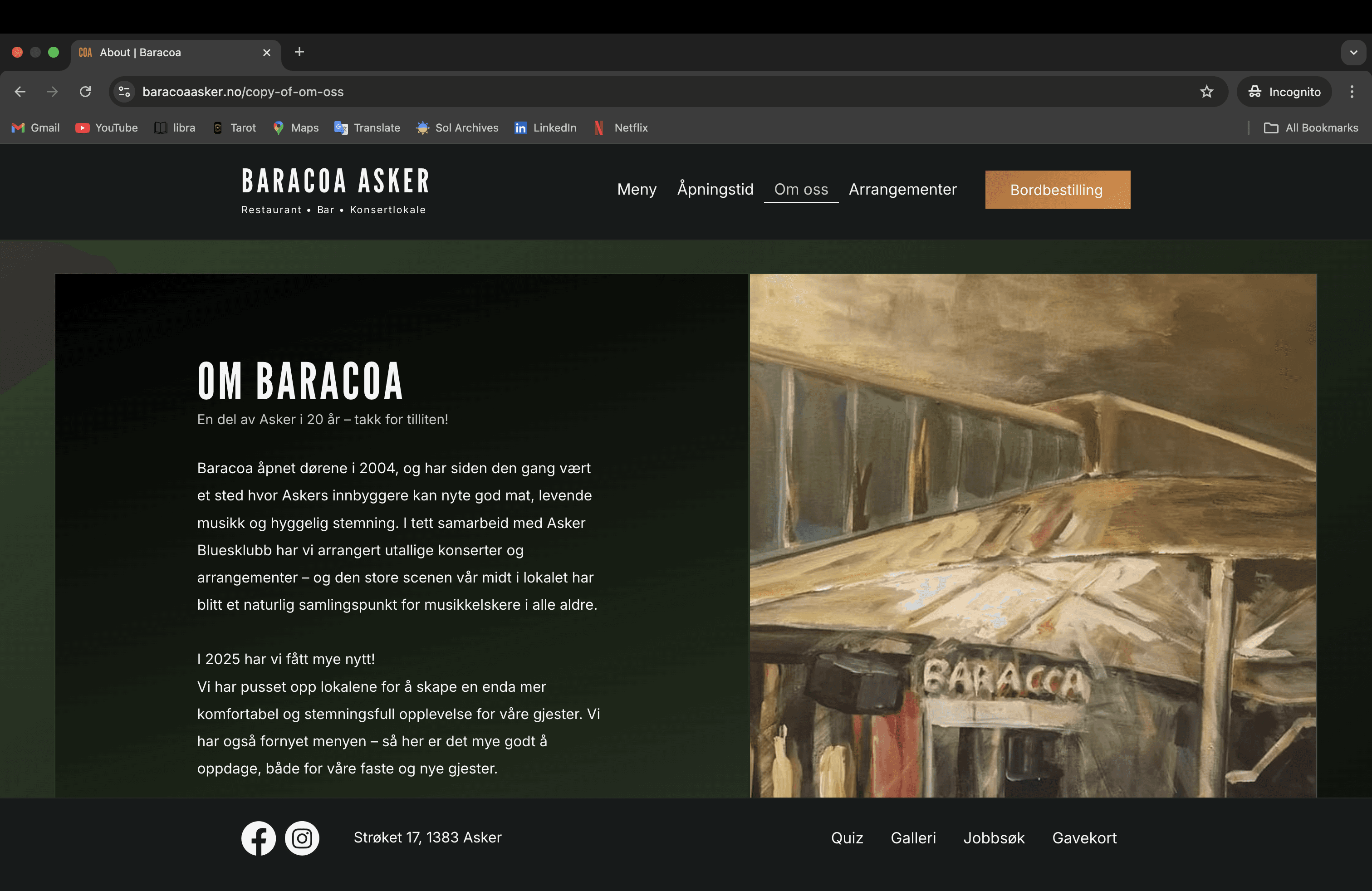
Baracoa Café is a restaurant and concert venue in Asker with over two decades of loyal customers. Following recent renovations and a kitchen expansion, the business needed an updated web presence aligned with its new visual identity.
My Role
• Full UX/UI redesign
• Development and implementation in Wix
• Content editing
• Basic SEO setup
Tools
Dates
July – September 2025
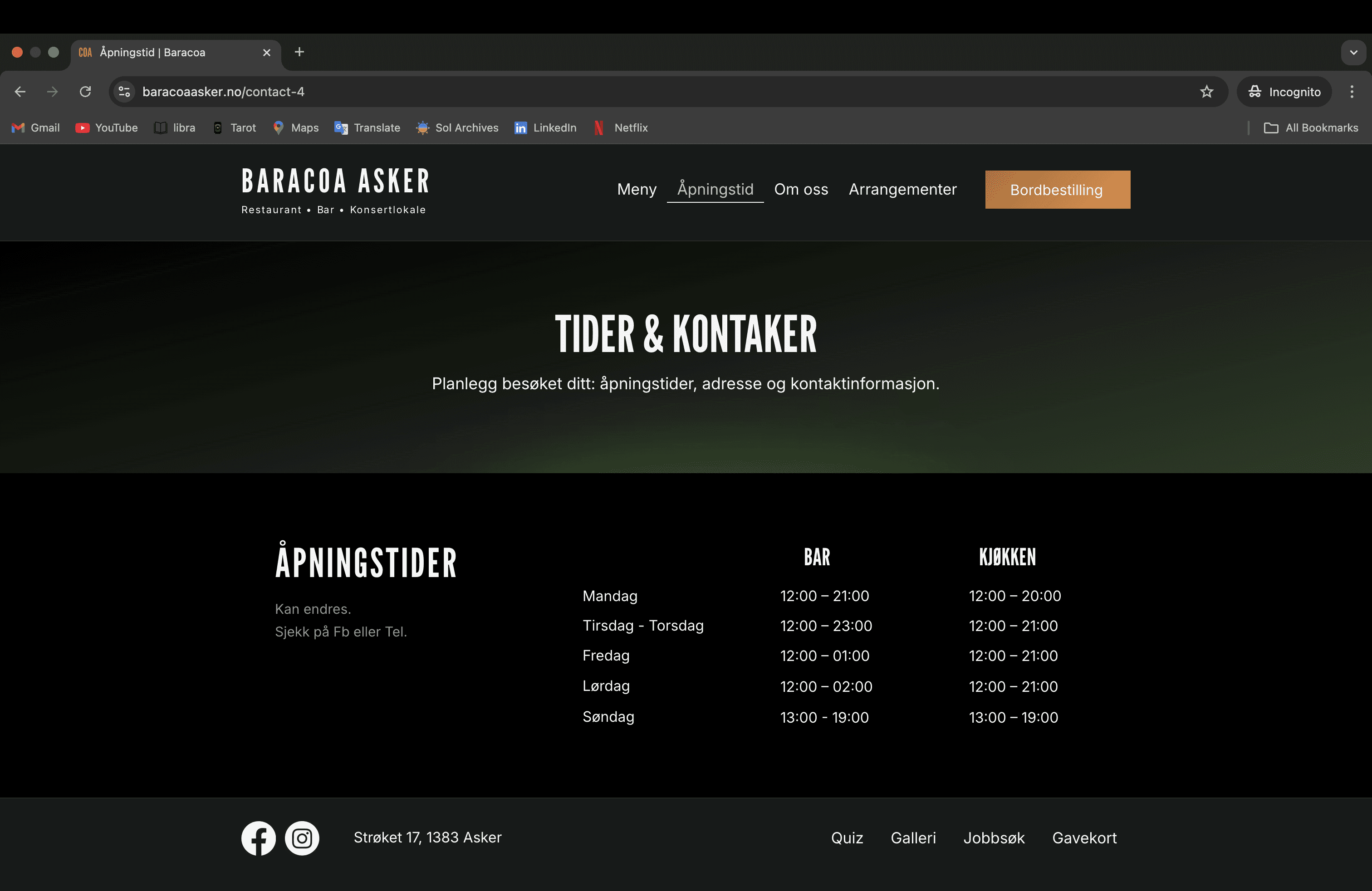
UX/UI Audit – Old Site
The original site no longer reflected Baracoa’s updated identity
• Outdated aesthetic
• Cluttered navigation
• Lack of coherence in design
• Hard-to-read text over background images
• Missing alt tags and no SEO structure
Design Reasoning
The first thing I learned about Baracoa was that the restaurant was quietly changing its identity. It wasn’t trying to be a quick grab-and-go spot anymore.
The owner wanted people to finally notice the food — the part of the business that had been overlooked for years.
My first draft leaned into nightlife: violet tones, neon, a bit of club energy. It looked bold, but it didn’t feel true.
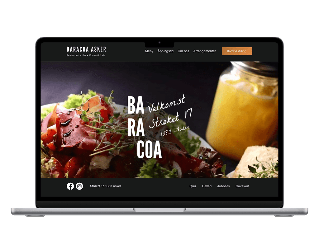
The space itself had just been renovated — deep khaki walls, muted wood, soft geometry. The room had a calm confidence to it. I wanted the website to echo that feeling.
There were also limits: no proper photos yet, a menu still finding its final shape. Instead of forcing a visual story that didn’t exist, I kept the design honest — clean, atmospheric, restrained. Dark tones with a quiet neon hint to keep a touch of evening energy.
The goal was simple: make it clear that Baracoa has grown up — it's not just a bar anymore — it's a proper dining destination..
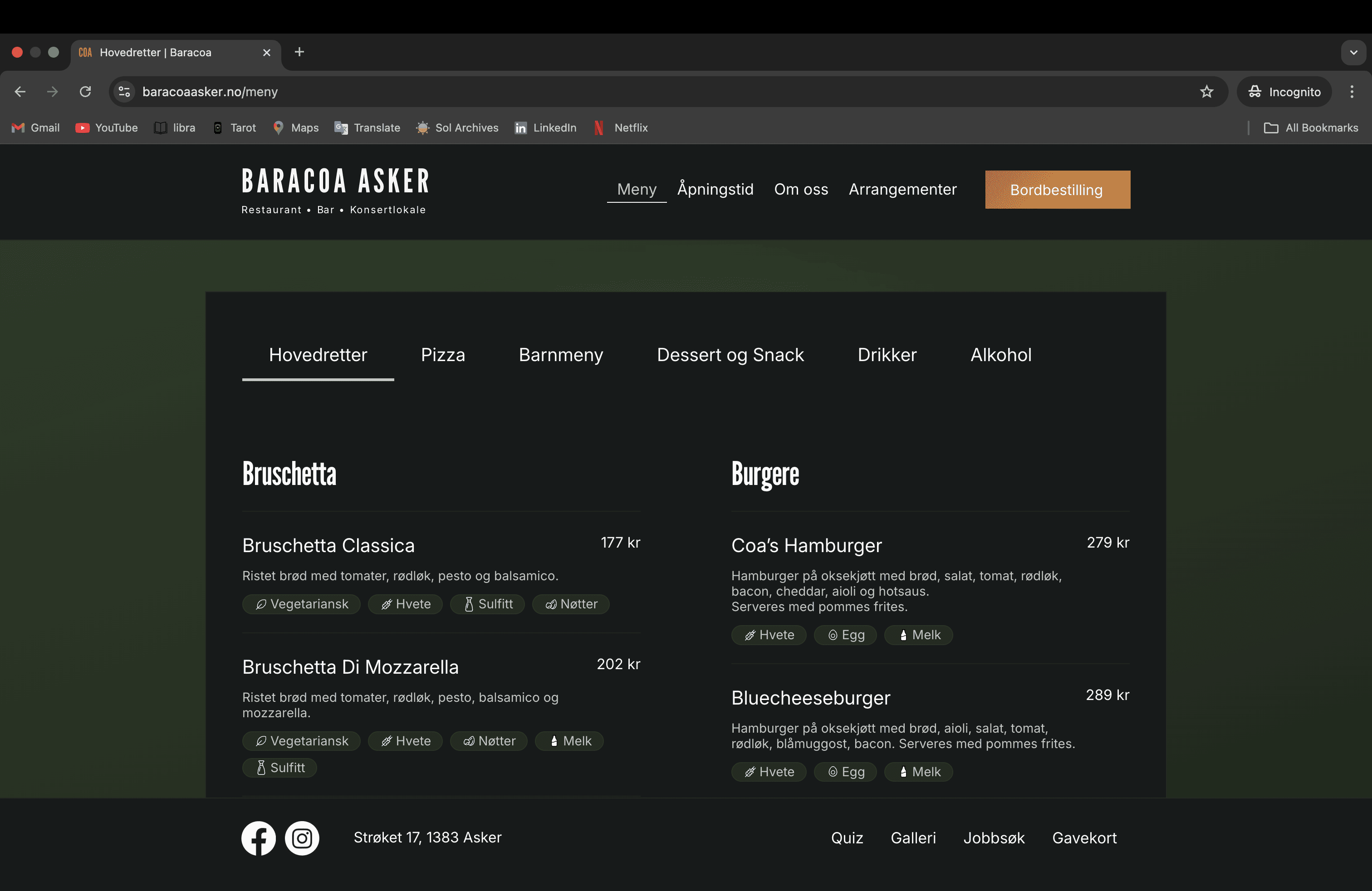
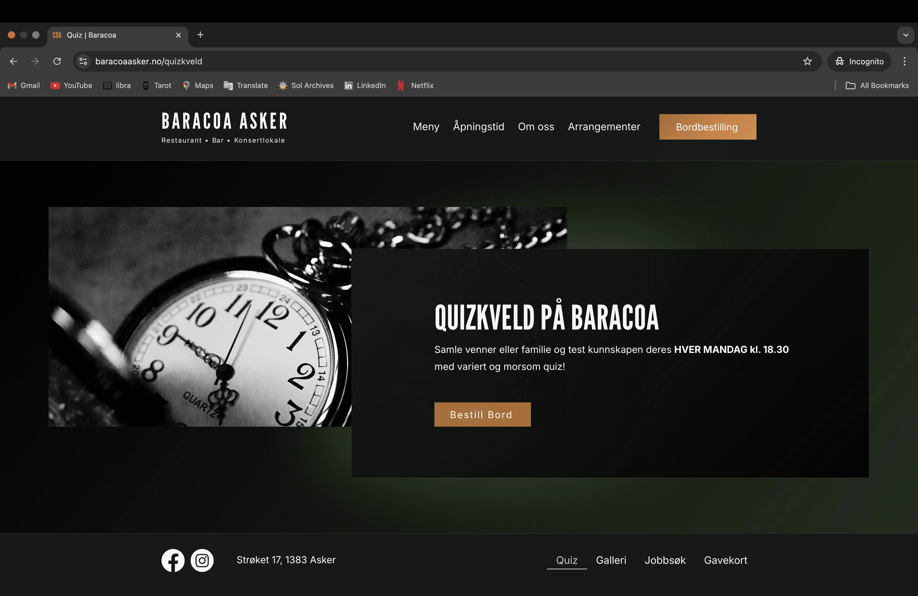
Visual Refresh
I aligned the design with the new interior: deep colors, contrast, and minimalist elegance to reflect the upgraded dining experience.
Structural Improvements
I cleaned up the sitemap, removing unnecessary pages, and created logical groupings for header and footer navigation.
Usability Enhancements
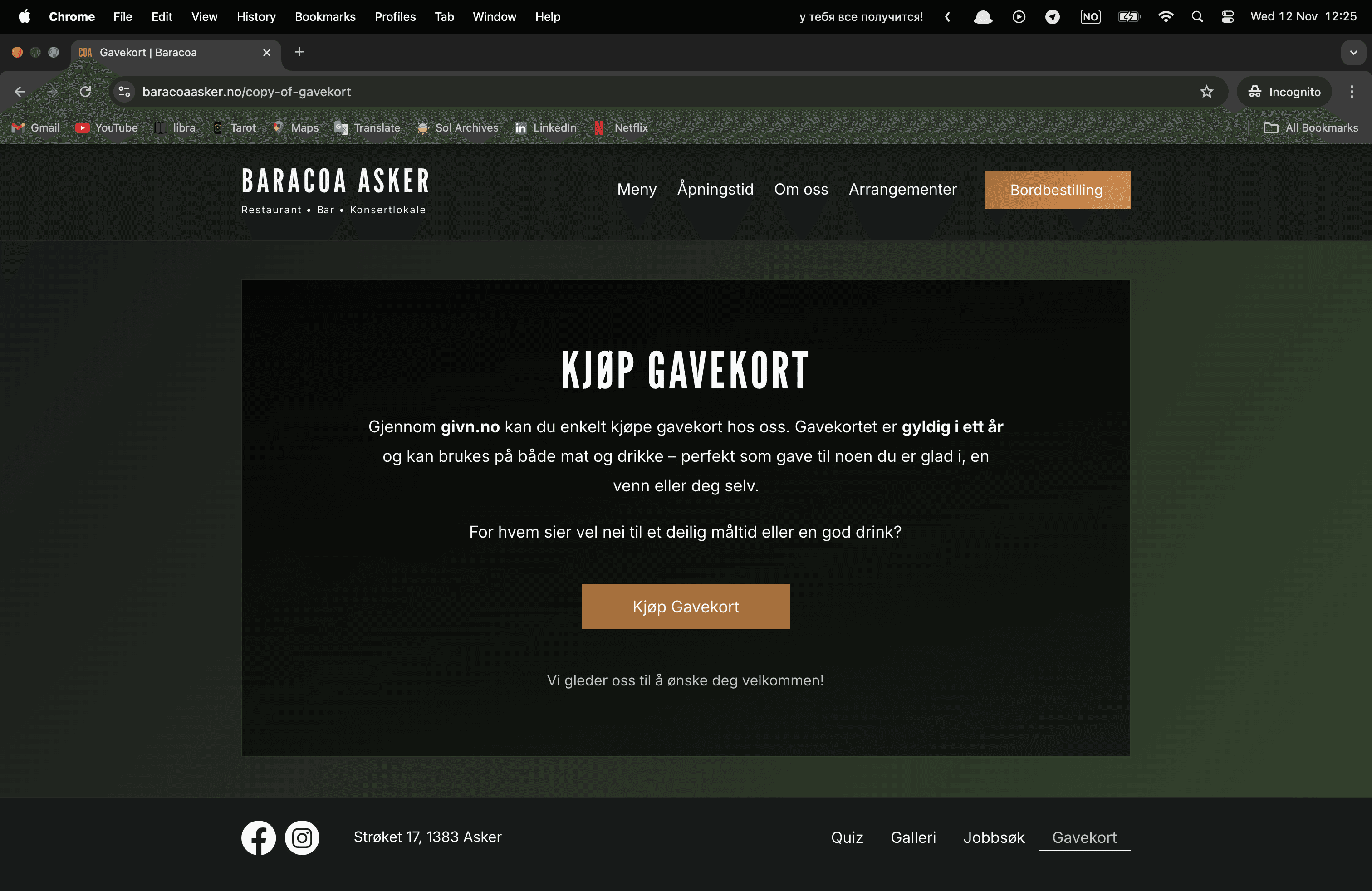
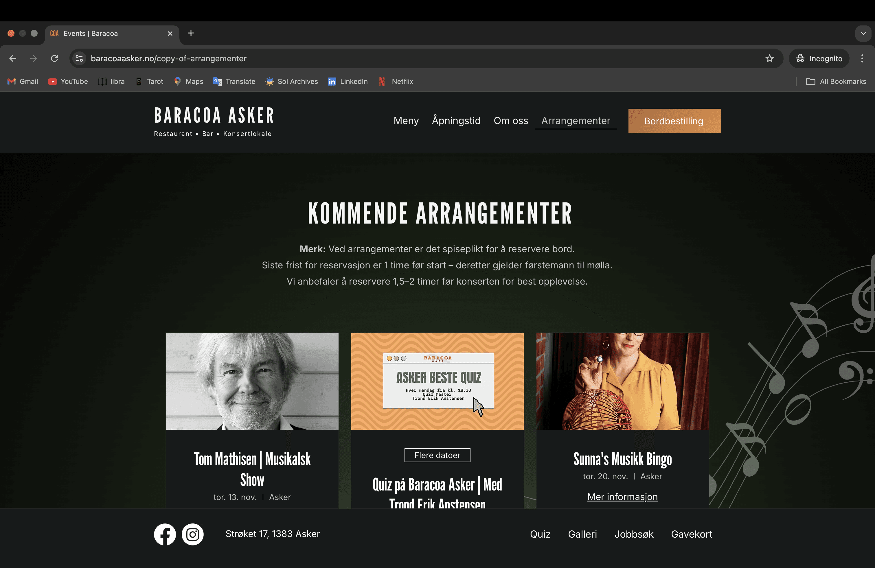
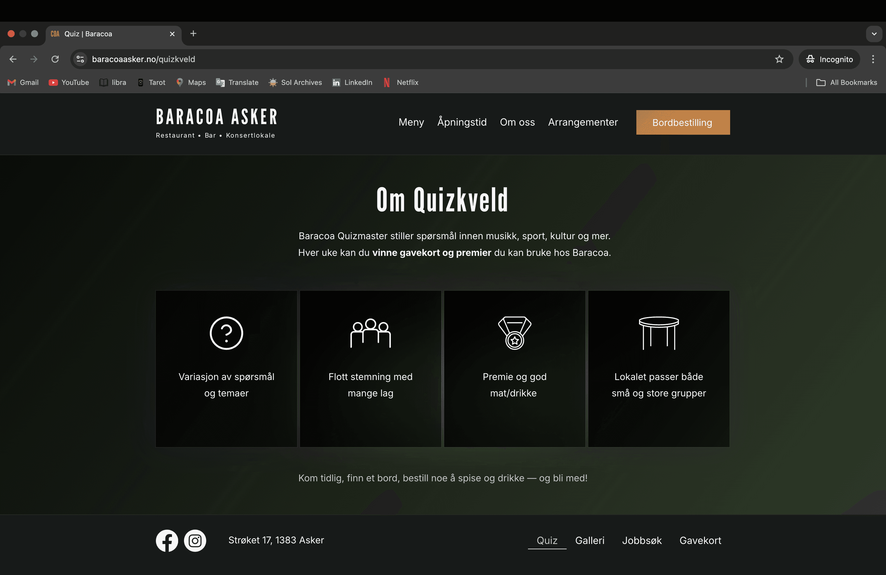
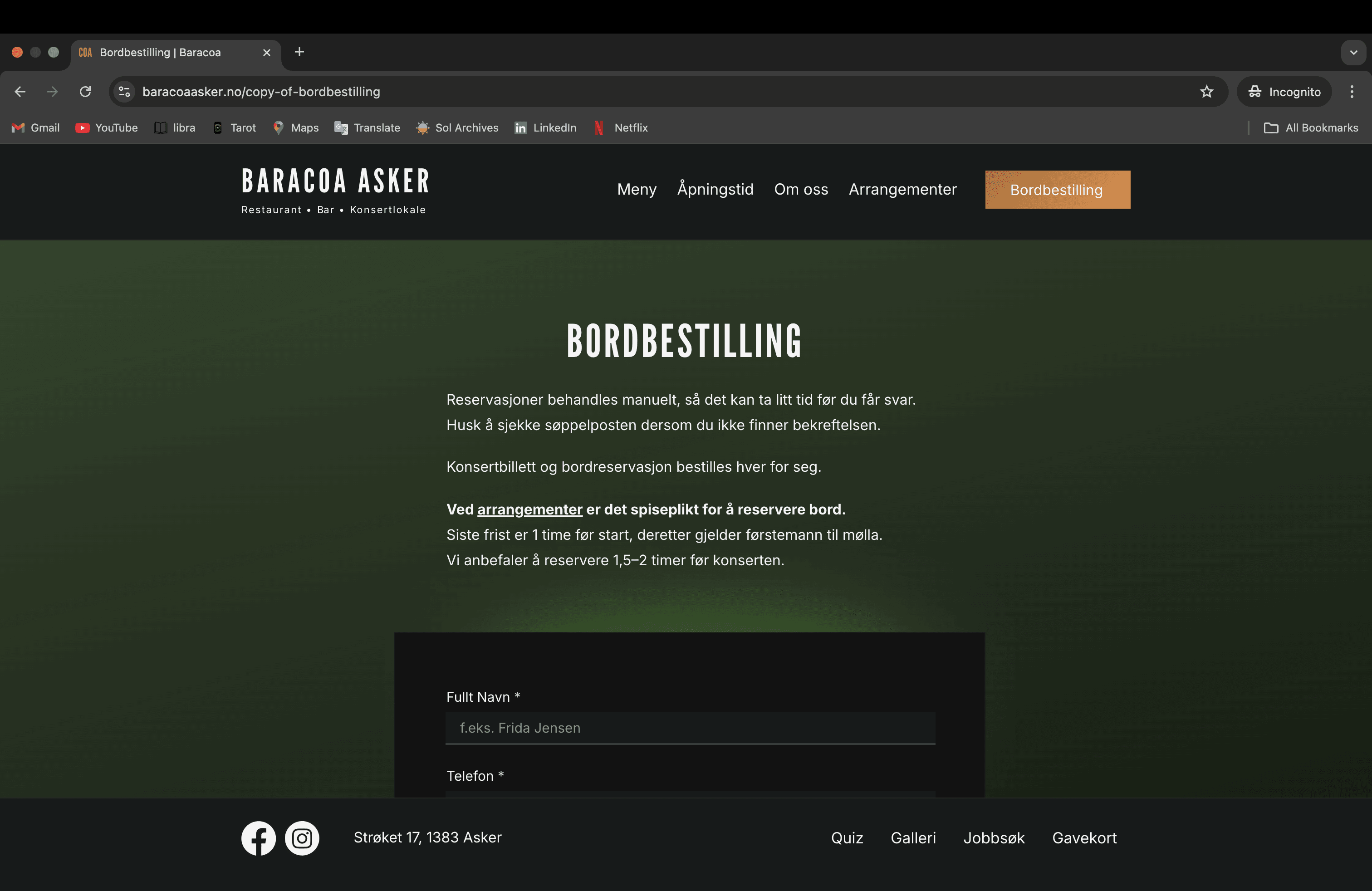
Clearer CTAs, better hierarchy, responsive layouts, and improved image treatment made the site more engaging and accessible.
Before & After – …home/hero section
Comparing old and new hero sections – highlighting structural and visual improvements.
Responsiveness
Website makes key user actions — checking the menu, booking a table, or buying a ticket — easy to do on mobile.
On mobile, the old site had no quick access to key actions — navigation was hard to find, buttons too small for touch. I introduced a fixed button in the thumb zone covering the three main intents: reservations, tickets, and contacts.
Seven weeks of data. Six metrics. One clear direction.
+6% Session Growth
2,770 sessions in 7 weeks after relaunch — steady upward trend compared to the previous period.
Direct Traffic +59%
Returning visitors increased significantly — people came back and remembered the address.
Facebook Organic
+137% The new visual identity started getting shared. People noticed the change.
78% Mobile Traffic
Most visitors came from phones — validating the mobile-first design approach and thumb-zone navigation.
1,134 Sessions from Oslo
Oslo visitors discovered Baracoa as a dining destination worth the trip.
84% New Visitors
The site is attracting people who had never visited before — not just loyal regulars.